Have you ever been completely captivated by the design of a new app, only to find yourself lost in a maze of confusing menus and unintuitive buttons? It’s a scenario many of us have encountered – a situation where a product boasts stunning visuals but fails to deliver a smooth and enjoyable user experience. This disconnect highlights the crucial, yet often misunderstood, roles of UI and UX design.
UI, or User Interface design, focuses on the aesthetics and functionality of a product’s interface. It’s the visual layer – the colors, fonts, buttons, and layouts that we interact with directly. UX, or User Experience design, delves deeper, encompassing the entire journey a user takes when interacting with a product. It considers user needs, behaviors, and emotions to create a seamless and satisfying experience from start to finish.
While both UI and UX are vital for a successful product, they’re not interchangeable. A common misconception is that they’re one and the same. In reality, they’re distinct yet complementary forces that work together to create a product that’s not only beautiful but also a joy to use. This blog aims to debunk the myths surrounding UI and UX design, explore their individual roles, and demonstrate how their harmonious collaboration leads to truly exceptional products.
Untangling UI and UX: Separating Fact from Fiction
Often used interchangeably, UI (User Interface) and UX (User Experience) are distinct but interwoven aspects of design. Let’s break down the key differences and shed light on some common myths.
UI Design: The Visual Playground
Imagine UI design as the visual storefront of a digital product. It’s all about the look and feel, the elements you directly interact with. This includes:
-
Visual Elements: Colors, fonts, icons, images, and animations - everything that shapes the app’s aesthetic.
-
Layout: How these elements are arranged on the screen. A clear and uncluttered layout makes navigation easier.
-
Aesthetics: The overall visual style evokes a certain feeling. Think sleek and modern for a music app or warm and inviting for a travel website.
Take a music streaming app, for example. Clear and recognizable icons for play, pause, and volume are crucial for usability. The layout should intuitively group similar music (genres, artists, playlists) for easy browsing. An aesthetically pleasing interface, with well-chosen color schemes and artist imagery, can further enhance the user experience.
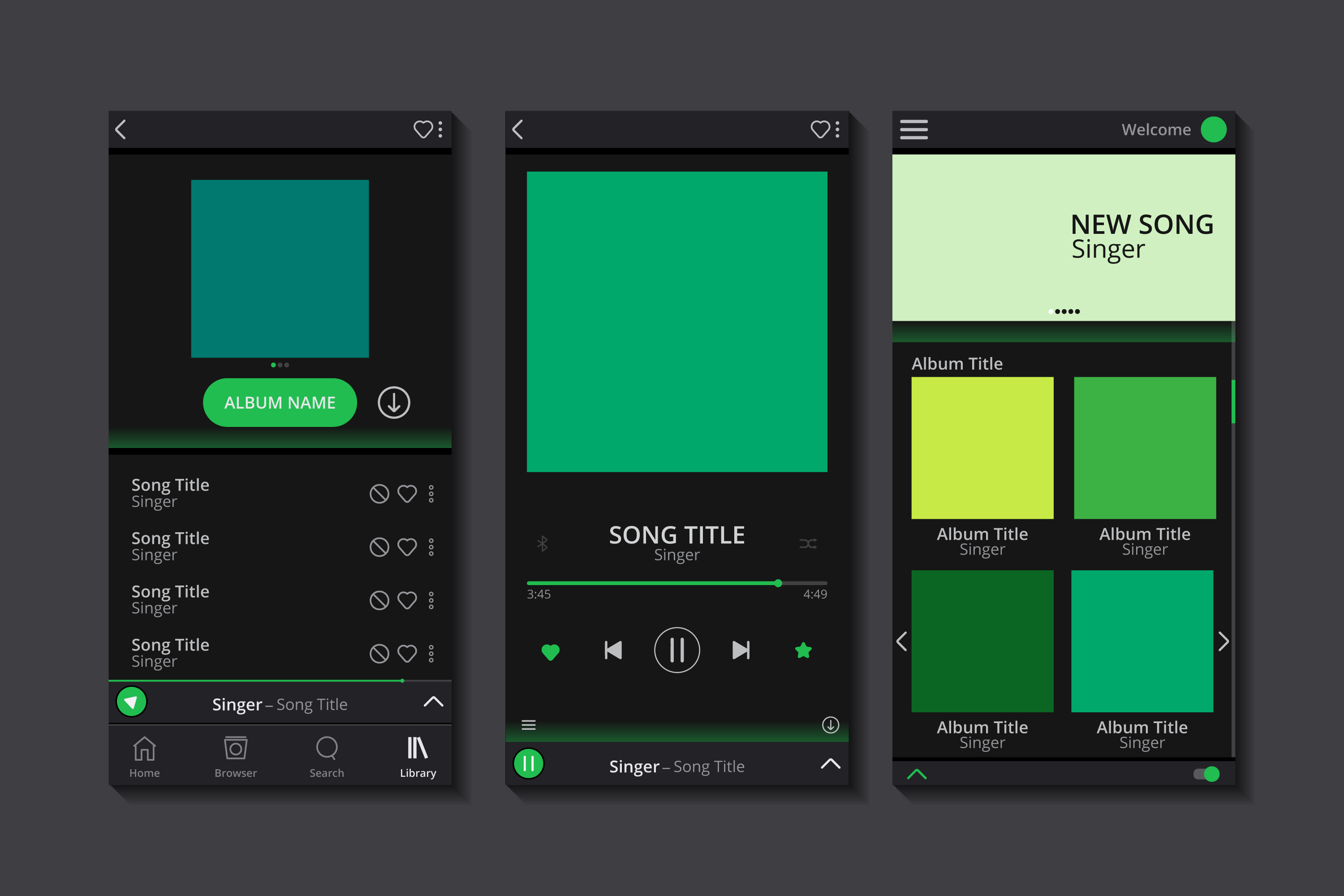 Image credit Freepik.com
UX Design: Beyond the Surface
Now, let’s delve deeper. UX design is the architect behind the scenes, crafting the user’s entire journey with a product. It encompasses:
-
User’s Overall Experience: This considers how users feel while interacting with the product. Is it smooth, efficient, and satisfying?
-
Information Architecture: How information is organized and presented. Users should be able to find what they need quickly and effortlessly.
-
Interaction: This involves user actions and how the product responds. Intuitive interactions build trust and keep users engaged.
-
Usability: How easy it is for users to achieve their goals within the product.
Continuing with the music app example, a UX win might be a streamlined signup process with clear instructions and minimal steps. Another example is personalized recommendations based on your listening habits, making it easier to discover new music. These UX elements all contribute to the user’s overall satisfaction with the app.
Debunking Common UI/UX Myths
The worlds of UI and UX design are often shrouded in misconceptions. Let’s peel back the layers and uncover the truths behind some of the most prevalent myths:
Myth #1: UX Design is All About Research and Data
Data and research are the cornerstones of UX design, but they’re not the whole story. UX design is also about creative problem-solving. Imagine an e-commerce website with a clear layout based on user research. However, the checkout process is cumbersome, requiring multiple steps and unnecessary information. Here, UX design comes in with creative solutions to streamline the checkout flow, making it faster and more user-friendly.
Myth #2: UI Design is Just About Making Things Look Good
While aesthetics are important, UI design goes far beyond visual appeal. It’s about ensuring usability – making the interface intuitive and user-friendly. Imagine an e-commerce website with a stunning homepage showcasing products. But if the navigation is confusing, finding specific items becomes a frustrating hunt. Users won’t be captivated by the visuals if they can’t find what they’re looking for quickly and easily.
Myth #3: A Fancy UI is Enough for a Successful Product
A beautiful website can be a magnet, but a confusing one will repel users just as quickly. Take a gorgeous e-commerce website with stunning product images and a sleek layout. But if the navigation is hidden behind cryptic icons, and the product information lacks clarity, the user experience suffers. Ultimately, a successful product requires both – a visually appealing UI that complements a seamless UX, guiding users towards their goals effortlessly.
To illustrate the above myths, let’s consider how an average-looking interface can be undermined by a frustrating user experience. This is often the case even with interfaces that may not be visually stunning. For a concrete example, you can checkout Userinyerface.
As a testament to both the above claims, a great example of how no matter how good the UI, bad UX(or in this case, no UX) can get super annoying for the user.
The Power of UI/UX Synergy: When Beauty Meets Brawn
We’ve busted the myth that UI and UX are rivals. In reality, they’re more like a Broadway power couple:
Imagine UI as the stage set-up. A stunning backdrop, well-placed props, and clear lighting all contribute to the experience. But a beautiful set with a nonsensical plot leaves you confused. That’s where UX comes in.
UX is the play itself. It’s the story, the flow, the way the audience interacts with the performance. Even the most captivating play suffers on a bare stage with flickering lights.
Together, UI and UX create magic. A user interface that’s attractive and easy to navigate keeps users engaged. Take Apple. Their products are known for sleek design (think the iconic iPhone) and intuitive interfaces (think dragging and dropping files). This seamless UI/UX combo fosters brand loyalty and makes users want to come back for more.
 Image credit Freepik.com
The magic isn’t limited to tech giants. Look at Airbnb. Their user-friendly app, with clear search filters and stunning property photos, makes finding your dream vacation rental a breeze. This translates to conversions – happy users booking stays!
 Image credit Freepik.com
So, the next time you encounter a website or app that feels effortless and delightful, remember, that it’s likely the result of a powerful UI/UX partnership.
To Sum Up
UI and UX design, though sometimes mistaken as interchangeable, are distinct yet interdependent disciplines. While UI focuses on the aesthetics and user interface, UX delves into the core user experience. Understanding both is crucial for crafting successful digital products that are not only visually appealing but also intuitive and user-friendly.
Whether you’re a designer, product developer, or simply someone interested in the digital world, delve deeper into UI/UX design. Explore online resources, attend workshops, or even consider a career path in this ever-evolving field. By fostering a well-rounded understanding of both UI and UX, you can contribute to creating digital experiences that are both beautiful and beneficial.


Share Your Thoughts
Comments on “Debunking Myths: What UI/UX Design is Really About”