
In the digital world, buttons are the unsung heroes. They are the gateways to conversions, the catalysts for action, and the silent persuaders that guide users through our meticulously crafted interfaces. But have you ever stopped to consider why users click on some buttons and ignore others? The answer lies in the fascinating interplay between UI/UX design and the psychology of human decision-making. This article delves into the power of buttons, exploring the psychological principles that influence user clicks and how A/B testing and user research can elevate your CTA button design to new heights.
The Allure of the Button: A Dance Between User Needs and Psychological Triggers
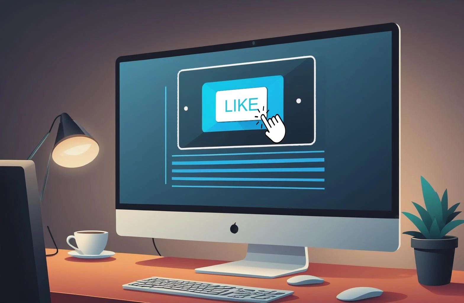
Imagine navigating a website. Banners flash, menus sprawl, and information bombards your senses. Yet, your eyes fixate on a single element: a brightly colored button emblazoned with the words “Download Now.” This seemingly simple interaction is a culmination of UI/UX design principles meticulously crafted to trigger specific psychological responses. The color, size, and wording of the button all play a part in influencing your decision.
Our brains are wired to react to certain stimuli. The psychology of buttons leverages this inherent human nature to nudge users towards desired actions. We crave gains (exclusive offers, free downloads), fear losses (limited-time deals, missing out), and seek a sense of completion (progress bars, clear next steps). By tapping into these motivations, UI/UX designers can craft buttons that resonate with users on a deeper level.
The Power of Perception: How UI Psychology Shapes User Clicks
Beyond motivation, cognitive factors significantly impact how users perceive and interact with buttons. Attention-grabbing elements like color, size, and contrast draw the eye, making prominent call-to-action (CTA) buttons stand out. Clarity of purpose is paramount. Button text should be concise and action-oriented, leaving no room for confusion about the intended outcome. Finally, designers rely on mental shortcuts and associations. Familiar button shapes (think the ubiquitous “play” triangle) and color psychology (red for urgency, green for confirmation) instantly communicate meaning, guiding users intuitively.
Crafting Effective CTAs: A Masterclass in User-Centered Design
Now that we understand the psychological principles at play, let’s delve into the art of designing effective CTA buttons. Here’s where the magic happens:
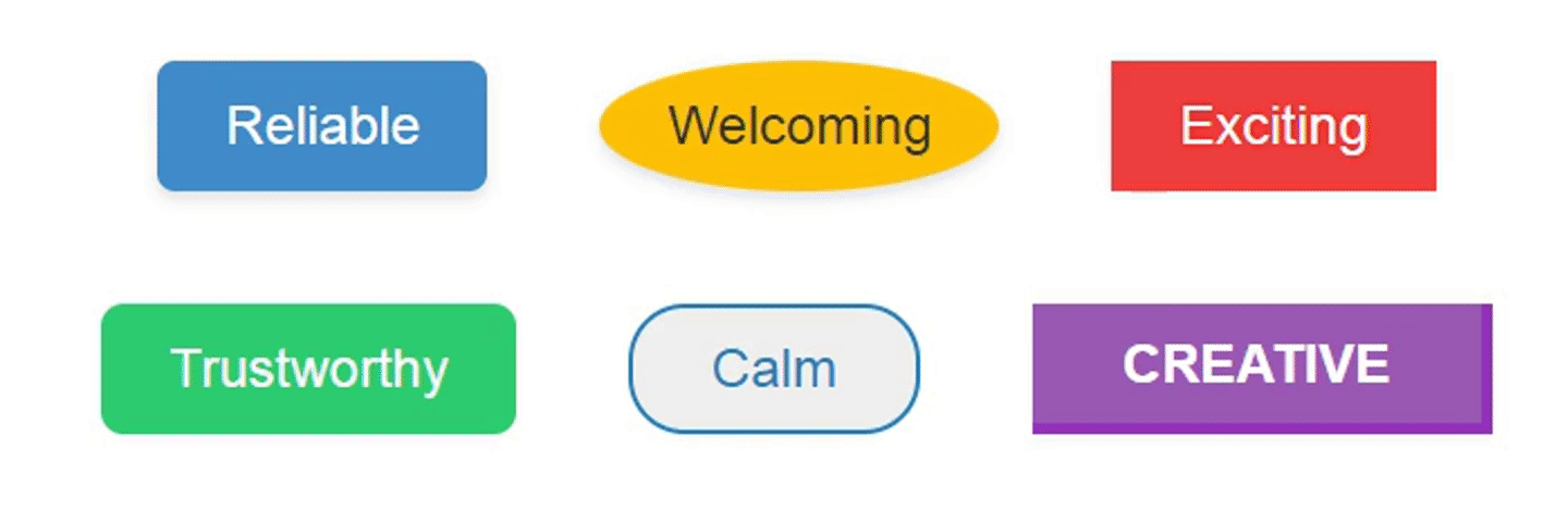
- Color Psychology: Colors evoke specific emotions. Red ignites urgency (“Buy Now!”), green signifies trust (“Add to Cart”), and blue promotes a sense of security (“Learn More”). Choose colors that resonate with the desired action.
- Button Size and Placement: Prominent CTAs deserve prime real estate. Use size and placement strategically to guide users towards the most crucial actions. For example, a large “Subscribe” button positioned below valuable content can significantly boost signup rates.
- Button Text and Wording: Ditch the generic “Submit.” Instead, use action-oriented verbs (“Download,” “Start Free Trial”) and highlight specific benefits (“Get 20% Off”). Conciseness is key – users won’t read lengthy button text.

A/B Testing and User Research: The Hallmarks of Continuous Improvement
The best CTA button design is an iterative process, not a one-time shot. Enter A/B testing and user research – your secret weapons for optimizing click-through rates. A/B testing allows you to compare different button variations (color, size, wording) to see which one resonates best with your target audience. User research, through surveys, user interviews, and clickstream analysis, provides invaluable insights into user behavior and preferences.

Imagine an e-commerce website struggling with low conversion rates. A/B testing reveals that a red “Buy Now” button initially used blends into the background. Replacing it with a contrasting green button with action-oriented text like “Add to Basket” leads to a significant increase in clicks. User research uncovers user confusion regarding the original “Buy Now” button, highlighting the need for clearer communication. This data-driven approach allows for continuous refinement, ensuring your CTAs are true conversion powerhouses.
To Sum Up
Buttons are more than just click targets; they are powerful tools for guiding user behavior and achieving desired outcomes. Understanding the psychology behind user clicks empowers designers to craft compelling CTAs that resonate with users on an emotional and cognitive level. By leveraging the principles of effective CTA button design, A/B testing, and user research, you can transform your buttons from silent persuaders into vocal champions of user experience.s
Share Your Thoughts
Comments on “The Psychology of Buttons : Why Users Click What They Click”